


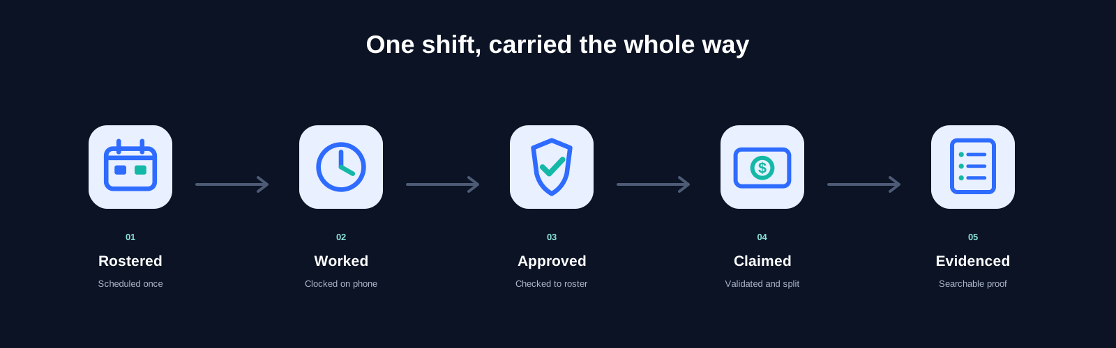
From roster to evidence
The same shift keeps one reference from roster to timesheet to claim to evidence. Nothing is retyped between steps, so the record cannot drift.
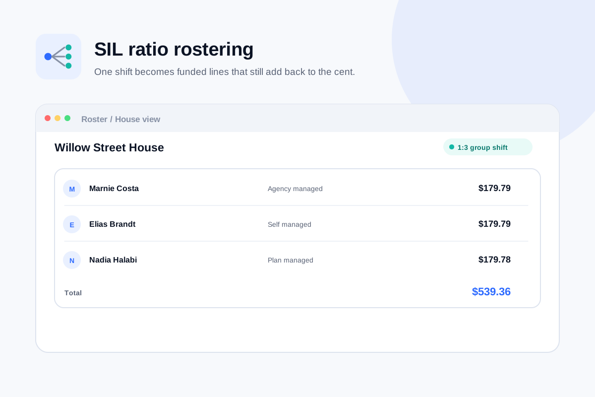
SIL ratio costing
A 1:3 group shift split across each resident's plan as it is rostered — to the cent, with the rounding recorded rather than hidden.
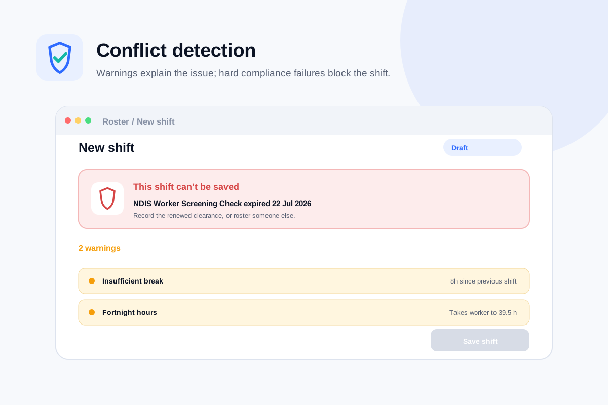
Fourteen checks before save
Double bookings, approved leave, insufficient breaks, unfunded supports — every check runs before a shift can save. A lapsed worker screening blocks it outright.
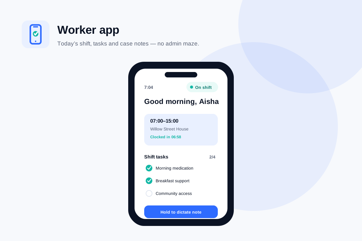
The worker app
The shift, its tasks and case notes on one screen, with one tap to clock in. Workers see this week's hours, not admin screens.
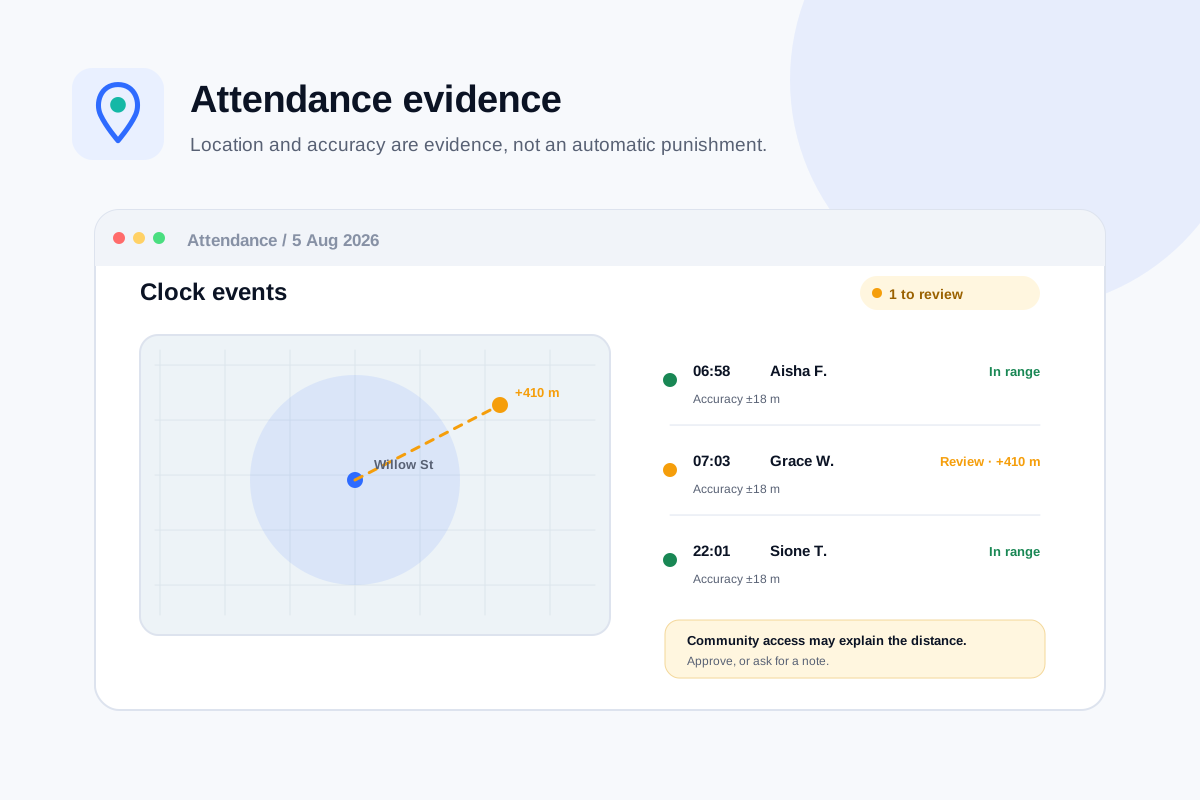
Attendance evidence
Clock events recorded with the accuracy radius of the GPS reading. Out of range is flagged amber for a manager to review — never auto-rejected, never used to withhold pay.
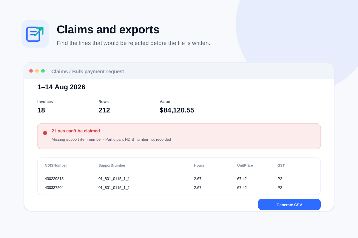
Claims that reconcile
Every line checked against the participant's plan and the date-effective price book before an NDIA bulk payment request is written. Problems are listed line by line.
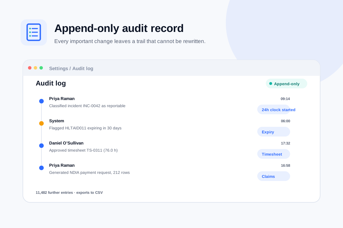
The append-only audit log
A record of who changed what, and when. Nothing in it can be edited or deleted — not by an owner, and not by us.